ShopDreamUp AI ArtDreamUp
Deviation Actions


Suggested Deviants


Suggested Collections


You Might Like…


Description
So I found this beaut lying around in my "I promise I will get around to it" folder. I thought it to be a shame to just leave it there so i wrapped it together this evening. Sorry if its a bit rougher than per usual but I hope you guys will still enjoy it. ^_^
Started this one back in January so its been on the shelf collecting dust for quite some time, enjoy!
Started this one back in January so its been on the shelf collecting dust for quite some time, enjoy!
Image size
4960x3507px 4.49 MB
© 2013 - 2024 Wreky
Comments14
Join the community to add your comment. Already a deviant? Log In
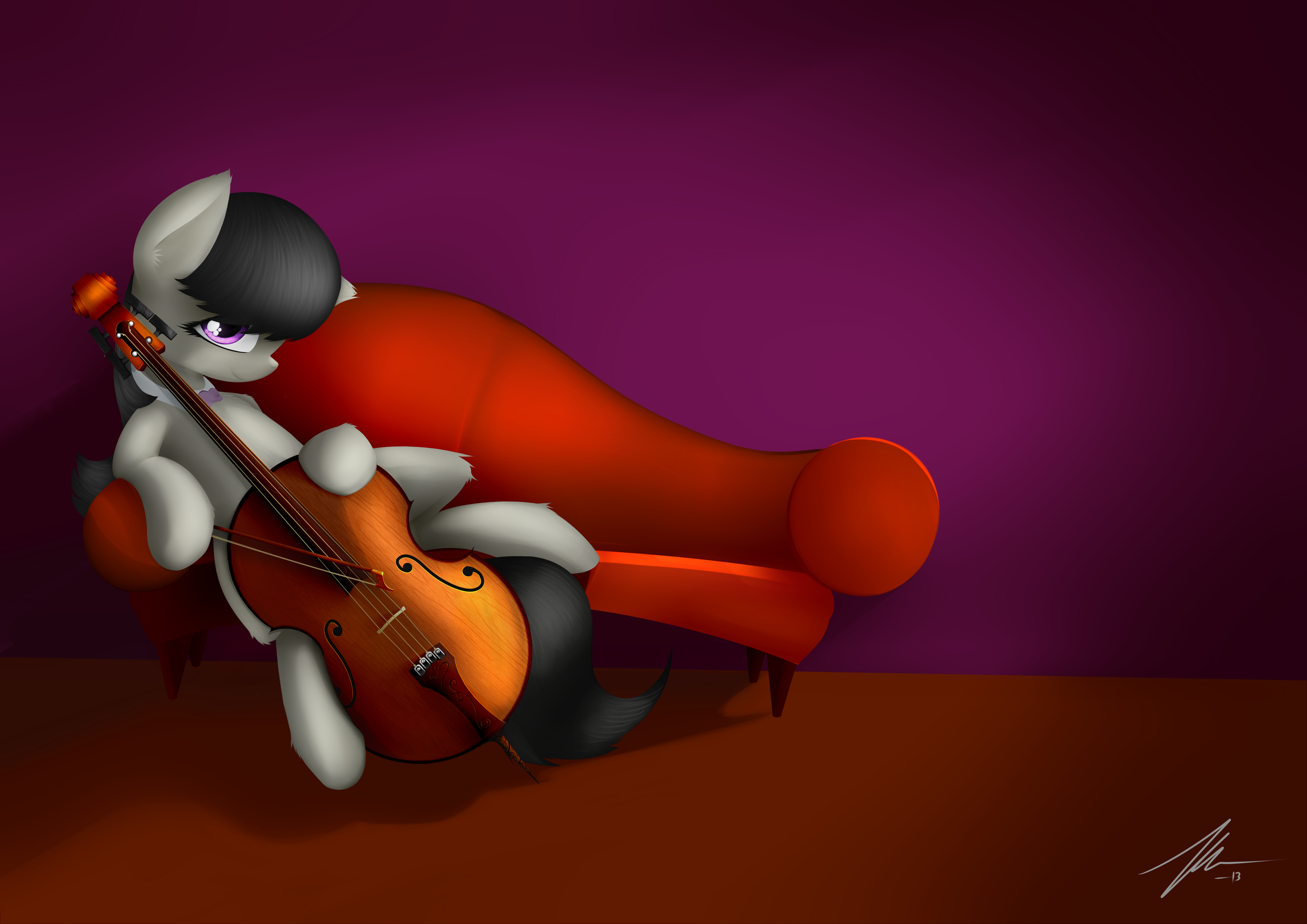
I work with instruments, so the majority of my review will be spent on the way you depicted Octavia's, but I'll touch on the rest as best I can.
Technically, you've drawn her cello—I'm assuming that it is meant to be a cello, but even if it's not, this still applies—wrong, but it's wrong in a way that has me convinced it's a stylistic choice rather than not caring enough to look at a reference picture. I don't really mind that it's wrong either, because it looks good and that's what matters in the end.
The first thing that jumps out to me is the fact that her instrument isn't shaped like a cello. It's actually shaped like a viol, minus the sloped shoulders and funky f-holes. It's both the biggest technical error, and the one I'm most willing to overlook. The rounder, softer, more minimalist shape of a viol fits the style you've drawn Octavia and the couch in much better than a cello's actual shape would have. The only thing I don't like about the shape of the instrument is those spikes on the corners. They fit the overall look of the picture in concept—they're reminiscent of the tufts of fur coming off Octavia's body—but they look really weird. I think it would have worked better to either leave them off or do some more messing around with their size and shape.
Next thing on the list is the f-holes. Congratulations on putting them (and the bridge) in the right place! You'd be surprised at how many people royally screw that up. They could stand to move in a little closer towards the center, both for technical and artistic reasons, but overall, I'm satisfied with how they look. Their actual shape and size are wonky, but in the same way as the outline of the instrument. It's a stylistic consideration that fits with the picture so I've got no complaints there. The only change I could suggest would be to widen the bars connecting the eyes a tiny bit and give them just a hint of more realistic shape. I think it would help give them a more coherent feel. Right now I get the sense that the f-holes are just two circles connected by a line instead of one whole shape.
I love how you took the time to add in the wood grain on the front of the instrument. That's not what the actual grain in an instrument looks like, but the actual grain pattern can be a bit boring anyway. Putting it in went a long way towards giving Octavia's cello a sense of life.
The other thing I really love is the color and lighting you chose. They combine to give the wood of her cello that muted, golden glow that looks so good in real instruments. You did very well withstanding the urge to give it a glossy sheen, that looks bad on real instruments and would have clashed horribly with the rest of your picture. I feel like the shadows aren't quite right, but you have used them to bring out the shape of the instrument in such a way that I'm convinced you actually know what that shape is.
I'm kind of disappointed by the lack of purfling (the black and white lines around the outside of the instrument). I feel like it would have actually helped a lot as the border between that dark band and the rest of the instrument.
The shape of the tailpiece and fingerboard are very nice and are another of the reasons why I feel most of your "errors" are appropriate stylistic decisions. They look right, and their minimalist shape works well with the overall design of the instrument. I am very disappointed to see, though, that the grain pattern you put on the front runs through them without any interruption. It's comes across as slapdash.
Another thing I genuinely didn't like is the scroll and pegbox. The strings in a cello don't run through the pegbox like that, they wind around the peg just like on a violin. The assembly you have there comes off of a double bass. The reason I don't like it is because I can't think of any compelling stylistic reasons to draw it like that and at least one to do it the technically correct way—I think the silver studs and diverging lines that the strings make pull the viewer's gaze away from Octavia's eye, which is much more important. On top of that, the entire scroll is too big. Even setting aside any technical considerations and looking at it from an artistic perspective, it looks too big for the instrument she's holding. The effect is like when you see a drawing of a beautifully proportioned human figure, but the artist messed up on the hands and made them too big.
Vision: I give you four stars here. I like the subject matter and I think the minimalist style you chose resonates perfectly with it. I only gave four stars because in the end, it doesn't really speak of much beyond the surface layer of Octavia With Her Instrument.
Originality: I gave three and a half stars here because, while I like the execution more than most, what you have here is a well done variation on an oft visited theme. You didn't exactly re-define a genre, or even a subject here.
Technique: I think your color choice was perfect. The couch, background, cello, and Octavia's colors all go together really well. I really like your use of shape as well. I only give three stars, though, because I think there's a lot of work to do in some of the other aspects of the picture. Your shadows are all over the place. The couch has a shadow that indicates a lightsource above and behind it, while the shadows on the cello seem to be cast with a lightsource about even in height with the tailpiece, slightly in front of the cello, and pointed up.
I also think there's way too much negative space. I like the decision of having some, but there's more here than you need. When I zoom in, my monitor cuts off everything above Octavia's ear and below lower hoof. I much prefer those borders for this picture. You still get the positive compositional effects of the negative space by keeping everything to her right, but it removes the dead space above and below her and gives the whole piece a more intimate feel. I think a simple crop job along those lines would do wonders for this picture.
The last gripe I've got on the subject of technique is my complaint from earlier about how the grain pattern on the front of the instrument runs right through the tailpiece and fingerboard without any regards for the fact that they're completely different objects.
Impact: I give four stars because you've done what I've been looking for a long time, a picture of Octavia and her instrument that actually treats her instrument as more than just a prop. The amount of consideration and work you put into its design and keeping it up to snuff with the rest of the picture went a long way towards that. I only give it four stars because, while I like the execution and the effect, I still can't shake the feeling that I've seen this picture several times before and it's really not that exciting or thought provoking.