ShopDreamUp AI ArtDreamUp


Suggested Deviants


Suggested Collections


You Might Like…


![[Commission] Roan the Barbarian](https://images-wixmp-ed30a86b8c4ca887773594c2.wixmp.com/f/a263e7bf-c4d7-40a4-a3e6-571b36c21c50/d819b8v-2c5875e7-b520-4830-8bd0-8880c269197b.png/v1/crop/w_184,h_184,x_3,y_0,scl_0.065714285714286,q_70,strp/_commission__roan_the_barbarian_by_novabytes_d819b8v-92s-2x.jpg?token=eyJ0eXAiOiJKV1QiLCJhbGciOiJIUzI1NiJ9.eyJzdWIiOiJ1cm46YXBwOjdlMGQxODg5ODIyNjQzNzNhNWYwZDQxNWVhMGQyNmUwIiwiaXNzIjoidXJuOmFwcDo3ZTBkMTg4OTgyMjY0MzczYTVmMGQ0MTVlYTBkMjZlMCIsIm9iaiI6W1t7ImhlaWdodCI6Ijw9OTU2IiwicGF0aCI6IlwvZlwvYTI2M2U3YmYtYzRkNy00MGE0LWEzZTYtNTcxYjM2YzIxYzUwXC9kODE5Yjh2LTJjNTg3NWU3LWI1MjAtNDgzMC04YmQwLTg4ODBjMjY5MTk3Yi5wbmciLCJ3aWR0aCI6Ijw9MTAyNCJ9XV0sImF1ZCI6WyJ1cm46c2VydmljZTppbWFnZS5vcGVyYXRpb25zIl19.ODCd6SJTm73BM50fRpgiat0AdA01e1wTHG7HdNuS4G8)
![[Commission] Roan the Barbarian](https://images-wixmp-ed30a86b8c4ca887773594c2.wixmp.com/f/a263e7bf-c4d7-40a4-a3e6-571b36c21c50/d819b8v-2c5875e7-b520-4830-8bd0-8880c269197b.png/v1/crop/w_92,h_92,x_2,y_0,scl_0.032857142857143,q_70,strp/_commission__roan_the_barbarian_by_novabytes_d819b8v-92s.jpg?token=eyJ0eXAiOiJKV1QiLCJhbGciOiJIUzI1NiJ9.eyJzdWIiOiJ1cm46YXBwOjdlMGQxODg5ODIyNjQzNzNhNWYwZDQxNWVhMGQyNmUwIiwiaXNzIjoidXJuOmFwcDo3ZTBkMTg4OTgyMjY0MzczYTVmMGQ0MTVlYTBkMjZlMCIsIm9iaiI6W1t7ImhlaWdodCI6Ijw9OTU2IiwicGF0aCI6IlwvZlwvYTI2M2U3YmYtYzRkNy00MGE0LWEzZTYtNTcxYjM2YzIxYzUwXC9kODE5Yjh2LTJjNTg3NWU3LWI1MjAtNDgzMC04YmQwLTg4ODBjMjY5MTk3Yi5wbmciLCJ3aWR0aCI6Ijw9MTAyNCJ9XV0sImF1ZCI6WyJ1cm46c2VydmljZTppbWFnZS5vcGVyYXRpb25zIl19.ODCd6SJTm73BM50fRpgiat0AdA01e1wTHG7HdNuS4G8)


![[Patreon Reward]Norse Jokage](https://images-wixmp-ed30a86b8c4ca887773594c2.wixmp.com/f/b70f0bcf-6bb1-4c0f-b9e4-9c79e1e90ac8/dd3p9u8-292a97de-eefb-436e-a2f1-7f3ff9f1d388.png/v1/crop/w_184,h_184,x_28,y_0,scl_0.1472/_patreon_reward_norse_jokage_by_lunarfroxy_dd3p9u8-92s-2x.png?token=eyJ0eXAiOiJKV1QiLCJhbGciOiJIUzI1NiJ9.eyJzdWIiOiJ1cm46YXBwOjdlMGQxODg5ODIyNjQzNzNhNWYwZDQxNWVhMGQyNmUwIiwiaXNzIjoidXJuOmFwcDo3ZTBkMTg4OTgyMjY0MzczYTVmMGQ0MTVlYTBkMjZlMCIsIm9iaiI6W1t7ImhlaWdodCI6Ijw9ODAwIiwicGF0aCI6IlwvZlwvYjcwZjBiY2YtNmJiMS00YzBmLWI5ZTQtOWM3OWUxZTkwYWM4XC9kZDNwOXU4LTI5MmE5N2RlLWVlZmItNDM2ZS1hMmYxLTdmM2ZmOWYxZDM4OC5wbmciLCJ3aWR0aCI6Ijw9MTI4MCJ9XV0sImF1ZCI6WyJ1cm46c2VydmljZTppbWFnZS5vcGVyYXRpb25zIl19.LV9HeKSRO9H4dganL8Ljo8fiJ-ApRrNNCExkCKe5xLs)
![[Patreon Reward]Norse Jokage](https://images-wixmp-ed30a86b8c4ca887773594c2.wixmp.com/f/b70f0bcf-6bb1-4c0f-b9e4-9c79e1e90ac8/dd3p9u8-292a97de-eefb-436e-a2f1-7f3ff9f1d388.png/v1/crop/w_92,h_92,x_14,y_0,scl_0.0736/_patreon_reward_norse_jokage_by_lunarfroxy_dd3p9u8-92s.png?token=eyJ0eXAiOiJKV1QiLCJhbGciOiJIUzI1NiJ9.eyJzdWIiOiJ1cm46YXBwOjdlMGQxODg5ODIyNjQzNzNhNWYwZDQxNWVhMGQyNmUwIiwiaXNzIjoidXJuOmFwcDo3ZTBkMTg4OTgyMjY0MzczYTVmMGQ0MTVlYTBkMjZlMCIsIm9iaiI6W1t7ImhlaWdodCI6Ijw9ODAwIiwicGF0aCI6IlwvZlwvYjcwZjBiY2YtNmJiMS00YzBmLWI5ZTQtOWM3OWUxZTkwYWM4XC9kZDNwOXU4LTI5MmE5N2RlLWVlZmItNDM2ZS1hMmYxLTdmM2ZmOWYxZDM4OC5wbmciLCJ3aWR0aCI6Ijw9MTI4MCJ9XV0sImF1ZCI6WyJ1cm46c2VydmljZTppbWFnZS5vcGVyYXRpb25zIl19.LV9HeKSRO9H4dganL8Ljo8fiJ-ApRrNNCExkCKe5xLs)


Featured in Groups

Comments102
Join the community to add your comment. Already a deviant? Log In
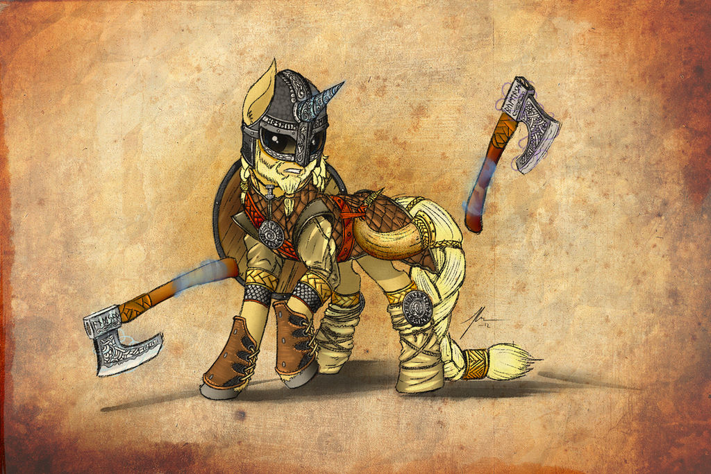
Let me start off by saying, "Viking pride!"
I'll start with what I feel needs improvement on. The magic surrounding the axes should surround the whole ax itself. In the show, when a character manipulates an object with magic, it tends to surround the whole object, even if they manipulate something within said object, the whole thing still shows the magic aura surrounding it. Take a book for instance, the whole book is surrounded with the indicating magic aura, but even when pages are turned, the whole book stays in that aura. The viking pony is handling only the handles, which makes sense, but I still feel the whole of the axes should be surrounded by the aura.
The other thing I feel could use some improvement on is the eyes. The whole eye area should be a little brighter and more visible. Yes, he's wearing a helmet, but I still think a little more light would have gotten through the openings.
With that out of the way, let's move on to what I like (the fun part). First of all, this is a brilliant concept! I have yet to see any viking ponies, and there needs to be more of them, especially given the rich environment for stories and art this subject matter could produce.
You may not think highly of the coloring, but I do. The red blends beautifully with the blonde and brown. No color stand out too much, and as a whole, the coloring never seems bland.
While I'll always say you have an eye for detail, one of the things I do wish to highlight is the fact that the runes spell out actual words. Some would throw these together just for some "mystic" effect, but they would have no meaning to them, which I find kind of lazy. You on the other hand either had previous experience with them or did you homework, and to me, that says three things: either you wanted this to be as authentic as possible, you love the subject matter or both (I can only guess which one <img src="e.deviantart.net/emoticons/w/w…" width="15" height="15" alt="
I like the background you chose. It feels like it was from a piece of parchment very much from that time period, but I also want to note how you colored the pony as if it were created today. This give it the feel of the best of both worlds, something from the past and present. Coloring the pony also allows us to see the vision you wanted us to see. While you could have made it look faded and ancient, which would have been fine, sometimes it's better for the audience to see exactly as you want us to see it.
You clearly had a lot of fun making this creation and it shows. Ignore the fact that I'm also Scandinavian, I can tell when an artist has a lot of fun making a piece of work, and showing it to others makes it all the more enjoyable. I hope to see more works like this because you clearly struck gold.
In closing, I just want to say you should be very proud of this work Wreky. While it sounds like you fudged some pieces of it, name me an artist who hasn't done that. I personally feel this is one of your best drawings to date; what makes it stand out is the pony itself, he looks like you have the form down to a tee, and that is a show of your improvement. Keep up the good work, I'll be there watching and smiling.